Getting Started with Kaluza: Data Scaling and Compensation Adjustment
This application note will show you how to adjust the data scaling and fluorescence compensation of flow cytometry data in Kaluza* by using the Add All Plots function, Spillover and Logicle Sliders.
The importance of data scaling
When displaying data on a logarithmic scale (Log), correctly compensated flow cytometry data may appear to be incorrectly over-compensated because events with negative values tend to pile along the axes; this distortion occurs because negative values do not exist on a Log scale.
To correct this issue, Kaluza Analysis features the Logicle scale (Figure 1), which allows you to correctly display compensated data. Changing an axis from Log to Logicle scale splits the axis into two different regions, where the positive values remain in Log scale and negative values are transformed into Linear scale. The two different scales are divided by a slider, which provides the ability to interactively control the width of each region. When using the Logicle scale, negative values are displayed correctly, preserving the desired symmetrical appearance of correctly compensated data. Data for this app note was generated using a normal whole blood sample stained with DuraClone IM Phenotyping Basic Tube* (PN: B53309), acquired on a CytoFLEX LX cytometer* (PN: C40324) and analyzed using Kaluza Analysis Software*. For detailed instructions on using Kaluza Analysis Software, please refer to the Kaluza Analysis Software Instructions for Use (PN: C10986). This application note does not replace Instructions for Use.
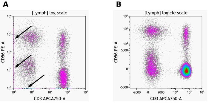
Figure 1: Example of logarithmic and logicle scaling of the same data set. Arrows in A indicate data points on the axis. Plots are for illustration purposes only.
Fluorescence spillover of fluorochromes into channels other than their designated detection channel is corrected by fluorescence compensation. Compensation artifacts can negatively impact downstream analysis if not corrected (Figure 2). Even if samples are acquired with the compensation matrix already applied, it is advisable to check and correct the compensation for all samples.
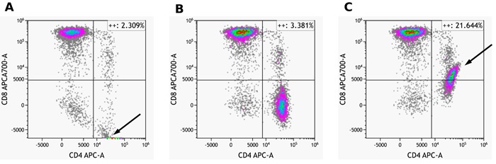
Figure 2: Shown is the same data set A) Fluorescence spillover for CD4-APC into the APCAA700 channel is overcompensated B) appropriately compensated C) undercompensated. Arrows in A and C show compensation artefact. Plots are for illustration purposes only.
The Add All Plots functionality enables you to quickly generate plots to compare all fluorescence parameters to each other. This can provide a comprehensive overview of the data in order to make scaling and compensation adjustment. In the following we will describe a possible workflow to adjust data scaling and compensation for a multi color data set.
Add All Plots
The Add All Plots Options menu allows you to configure the plot and gate types that are included when Add All Plots is selected. Any selections you make will be remembered by Kaluza and will be applied automatically the next time you click on the Add All Plots icon.
From the Plots & Tables ribbon tab, click the drop-down arrow on the “Add All Plots” icon to customize which plots will be included on the plot sheet. To follow the workflow outlined in this application note, make selections as shown in Figure 3.
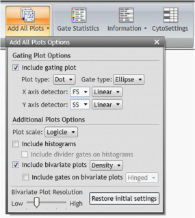
Figure 3: Add All Plots Options selections used for the example shown here. Include gating plot with plot type: Dot and Gate Type: Ellipse, chose FS Linear and SS Linear as X axis and Y axis detectors, respectively.
Click on Add All Plots to create plots. A dot plot comparing Forward and Side scatter including an elliptical gate identifying population “A” will be created. In addition, density plots comparing all fluorescence parameters to each other gated on population “A” will appear.
Adjusting Data Scaling
Depending on the cytometer used, the instrument settings and the $CYT default scaling settings in Kaluza, adjustments to the position of gate A and the data scaling may be needed (Figure 4)
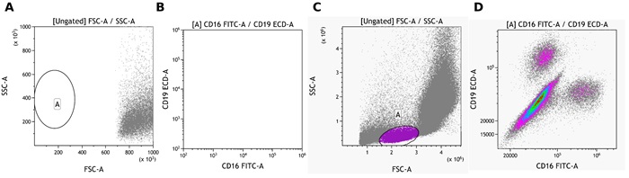
Figure 4: A and B show CytoFLEX LX data with default settings. C and D show the same data set after adjustments of data scale, logicle transformation and position of gate A. Plots are for illustration purposes only
- In the Forward vs. Side Scatter Gating Plot, access the Radial Menu and open the Data Menu.
- Change the Display Min / Max (channels), for example by clicking on the hyperlink of the maximum channel or select Auto to have the software automatically set the upper and lower display limits of the axes based on the data already collected. Alternatively, you may use the Zoom tools to focus on a section of the plot.
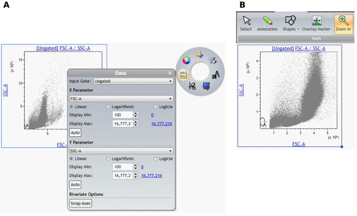
Figure 5: A) Data Menu with adjusted Display Max setting B) Data after Zooming in. Plots are for illustration purposes only.
- Move Gate A to include the population of interest. Use the Display Menu to adjust the resolution as needed.
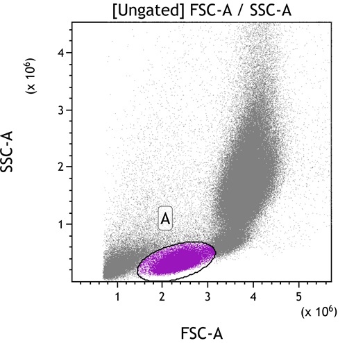
Figure 6: A) Data Menu with adjusted Display Max setting B) Data after Zooming in. Plots are for illustration purposes only.
- Adjust the Logicle transformation and if required the Display Maximum for all fluorescence channels.
- To adjust the logicle transformation, select the plot you would like to adjust, select and drag the logicle slider appearing in the lower left corner to adjust the scale to display negative values (Figure 7 A and B).
- To adjust the logicle transformation, select the plot you would like to adjust, select and drag the logicle slider appearing in the lower left corner to adjust the scale to display negative values (Figure 7 A and B).
- To adjust the Display Maximum, right click on the plot to access the Radial Menu and open the Data Menu. Select the Hyperlink next to Display Max to select the Maximum channel value or manually set the Display Maximum (Figure 7 C and D). Repeat for all fluorescence channels.
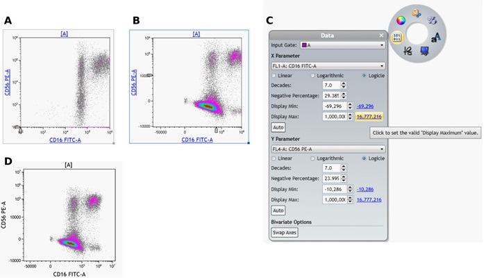
Figure 7: Data before (A) and after (B) adjustment of the logicle scale and before adjustment of the Display Max. C) Display Max hyperlink in the Data menu. D) Data after applying the appropriate logicle transformation settings and Display Max. Plots are for illustration purposes only.
- The Zoom In tool can be used to magnify a specific area of a plot.
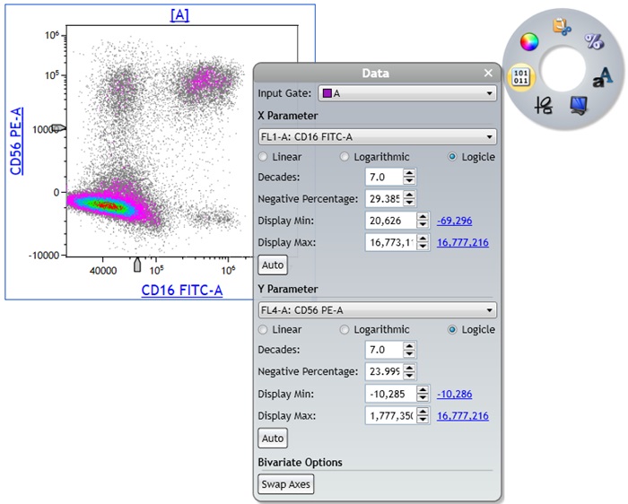
Figure 8: The Zoom In tool was used to magnify a specific plot area and the Data menu is shown to visualize the new Display Min and Max settings. Plots are for illustration purposes only.
TIPS FOR SUCCESS:
$CYT defaults
It is possible to define the default scaling used for all data files from specific cytometer models. This will save time on manual scale adjustments. To set the default scale, determine the desired Min and Max values for linear scatter and logarithmically or logically displayed fluorescence parameters as well as the desired number of decades to be shown for fluorescence parameters and the Width for the logicle transformation. The Width setting determines the width of the negative data range and the range of linearized data in ‘‘decades”. This should be optimized by panel but choosing an appropriate default value for an instrument and instrument settings can reduce the amount of adjustment needed.
Select the Kaluza icon and Kaluza Options.
In the Kaluza Options menu navigate to the $CYT Defaults tab.
On the left side panel, select the instrument for which you would like to set the scaling defaults.
Scroll to the Parameter Scale section in the main configuration area
Set the Linear, Log, and Logicle parameter scales either at Default, or set the Min, Max, Decades, and Width at any desired value within the given range.
Select Apply and OK to return to your analysis.
Scale Mode
Kaluza offers 2 different Scale Modes. The Scale Mode configures the default plot axis scale Full Range scale is up to 7 decades, depending on the maximum number of channels detected by the cytometer. Legacy scale shows the data re-scaled to 4 decades or a maximum channel number of 1024. A comparison of the two Scale Mode settings is provided in Figure 9.
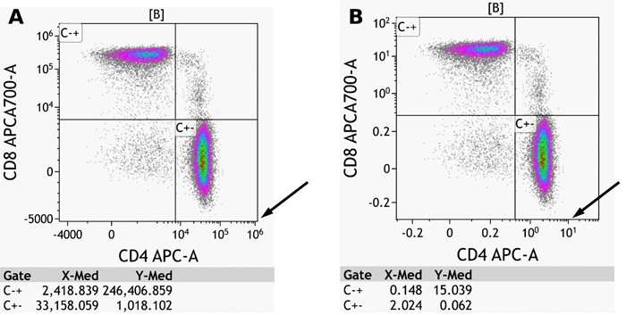
Figure 9: Shown is the same data with Full Range scale mode (A) and Legacy mode (B). Note that the appearance of the populations does not change. The axis scale differs and some fluorescence intensity measures such as median fluorescence intensity as shown in the example change in accordance to the axis scale. Plots are for illustration purposes only
The default setting for most cytometers is Full Range, with the exception of Navios (Legacy) and Astrios (Astrios scale mode). The default Scale Mode for a specific cytometer model can be selected in the Kaluza Option menu.
In the Kaluza Options menu navigate to the $CYT Defaults tab.
On the left side panel, select the instrument for which you would like to set the scaling defaults.
Scroll down to the Scale Mode section in the main configuration area
Select the desired Scale Mode Select Apply and OK to return to your analysis.
Any changes to the $CYT defaults will be effective for data sets loaded into Kaluza after the change has been made. It will not affect data sets already in the Analysis List.
The Scale Mode can also be chosen for a given analysis in the Analysis List. If unexpected results are observed, such as mean fluorescence measurements differing from what is observed in the acquisition software by a constant factor, check the scale mode and if appropriate change. To change the Scale Mode on a per Analysis basis, for all sheets and data sets within an Analysis or Composite: Right click on the Analysis in the Analysis List, mouse over Protocol Scale Mode and select the desired Scale Mode
NOTE: When a Composite is created for multi-file analysis, the scale mode is automatically switched to full range for all data sets.
Adjusting Compensation
Spillover Sliders allow you to compensate for fluorescence Spillover by using real-time visual cues on plots. The sliders can be generated on all applicable plots. For other options to modify the compensation matrix in Kaluza please refer to Kaluza Analysis Flow Cytometry Software IFU C10986.
To use the Spillover Sliders:
- From the Gates & Tools ribbon tab, select the Compensation icon. Applicable plots are now equipped with plot sliders (Figure 10 A).
- To update Spillover using the Spillover Sliders, click one of the sliders and in the direction of the desired change. The Spillover value is displayed next to the slider, as shown in Figure 10 B.
To make incremental adjustments to Spillover:
To move in increments of .1%: Select the appropriate arrow located on either end of the slider.
Each time an arrow is selected, the slider handle moves 0.1%. This change can also be viewed, numerically, in the Compensation pane. • To move in increments of 1%: Click on the slider bar; whichever side of the handle that you click on moves the slider 1% in that direction.
To move in increments of 1%: Click on the slider bar; whichever side of the handle that you click on moves the slider 1% in that direction.
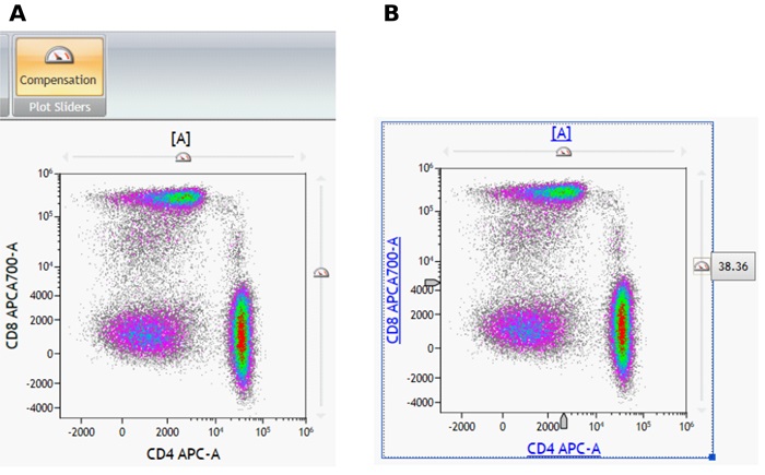
Figure 10: Compensation icon and density plot with compensation plot sliders (A) and spillover value (B). Plots are for illustration purposes only.
NOTE: The Spillover Sliders allow values between 0 and 100%. Adjustment values outside of this range must be entered manually into the Spillover matrix in the Compensation pane.
After adjusting the scale and compensation, the data is ready to be analyzed:
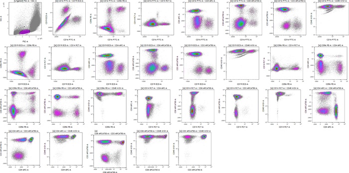
Figure 11: Visualization of all fluorescence marker combinations after scale and compensation adjustments. Plots are for illustration purposes only
